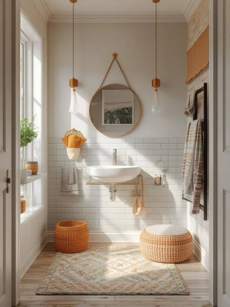
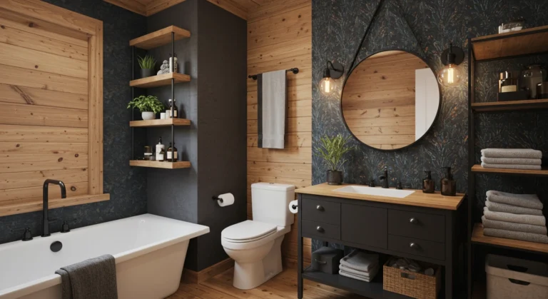
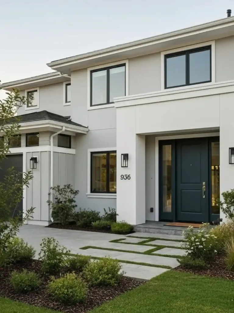
Best Way to Grow Style: 5 Benjamin Moore Paint Color Palette
Have you ever walked into a room where the colors just felt right? Where the walls, trim, and decor all worked together in perfect harmony? Creating that balanced feeling isn’t magic it’s thoughtful color coordination. A well-planned benjamin moore paint color palette can transform an ordinary space into something extraordinary, creating mood, depth, and personality.
Whether you’re renovating your entire home or simply refreshing a room, understanding benjamin moore color coordination principles will help you achieve professional-looking results without the guesswork. Let’s explore how to select, combine, and implement these designer-quality colors in your own home.
Table of Contents
Design Concept Overview
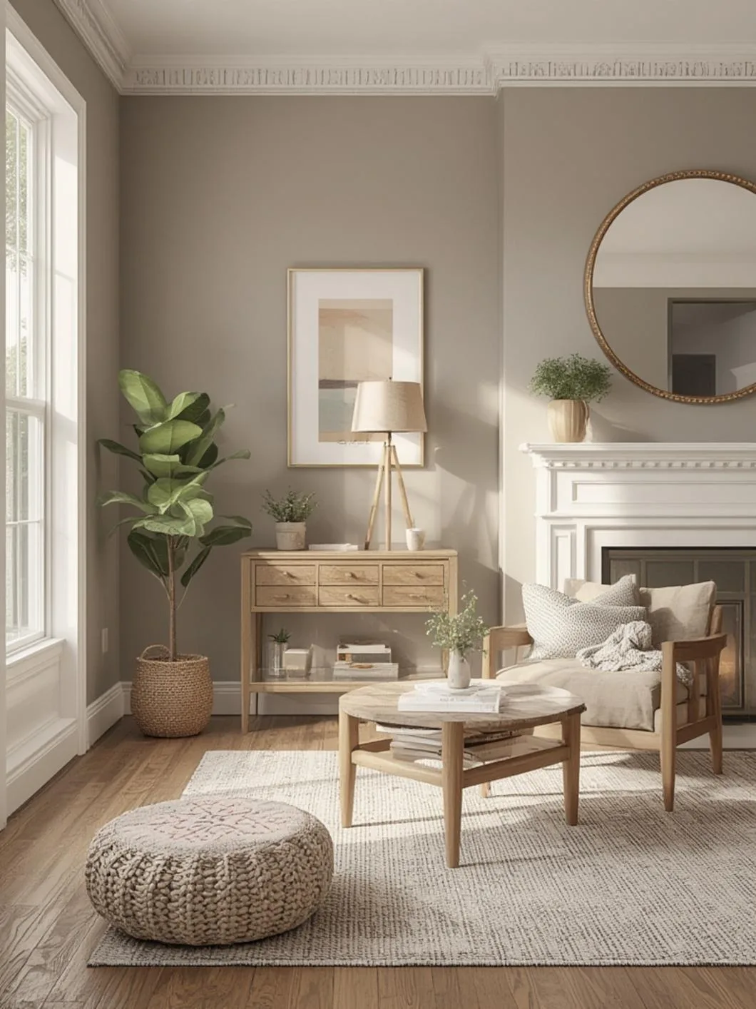
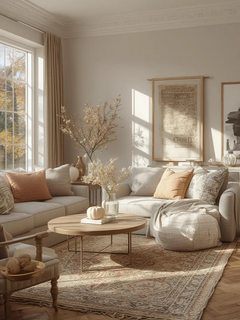
Benjamin Moore is renowned for its sophisticated color collections that blend seamlessly across various design styles. Their curated palettes offer versatility spanning from timeless neutrals to bold statement hues, with each shade meticulously formulated for superior depth and richness. These palettes work particularly well in transitional homes that balance traditional elements with contemporary touches.
The brilliance of Benjamin Moore’s approach lies in their color stories groups of complementary hues designed to work together across different rooms while maintaining visual flow. These thoughtfully crafted color relationships create spaces that feel cohesive yet interesting, allowing for natural transitions from room to room without abrupt visual disruptions.
Benjamin Moore palettes excel in varied lighting conditions an essential consideration since natural light can dramatically alter how paint appears throughout the day. Their color system accounts for these shifts, ensuring your selections remain beautiful regardless of time or weather conditions.
Materials, Colors & Key Elements
To successfully implement a Benjamin Moore color scheme, you’ll need:
Essential Materials:
– Benjamin Moore paint samples (pint-sized are ideal for testing)
– White poster board for sample testing (more accurate than painting directly on walls)
– High-quality paintbrushes and rollers appropriate for your paint finish
– Painter’s tape for clean lines
– Drop cloths to protect floors and furniture
– Paint trays and liners
– Extension poles for ceilings and high walls
Key Color Elements to Consider:
1. Base Colors: These anchor your palette and typically cover the largest surfaces (walls). Benjamin Moore’s “Color of the Year” selections make excellent starting points.
2. Accent Colors: Used for architectural details, furniture pieces, or feature walls.
3. Trim Colors: Most often whites or neutrals that frame your color choices (Benjamin Moore’s White Dove and Simply White are perennial favorites).
4. Ceiling Colors: Traditionally white, but soft tints of your wall color at 25-50% strength can add dimension.
Budget-Friendly Alternatives:
– Consider Benjamin Moore’s ben® or REGAL® Select lines instead of their premium Aura® line for less trafficked areas
– Purchase paint during seasonal sales (typically spring and fall)
– Use higher-quality paint for high-traffic areas and less expensive options for closets and utility spaces
Timing, Budget & Planning
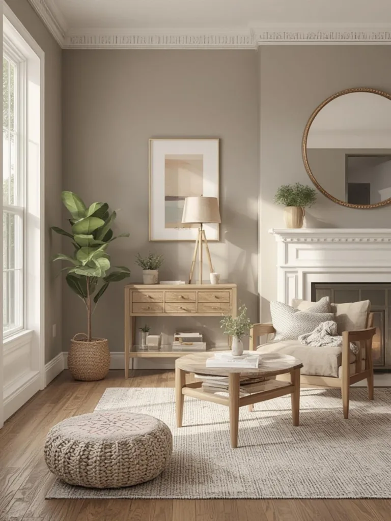
Budget Considerations:
– Entry-level Benjamin Moore paints: $45-60 per gallon
– Mid-range options: $60-75 per gallon
– Premium lines: $75-95+ per gallon
– Professional painting services: $2-6 per square foot (depending on location and complexity)
Typical Timeline:
– Color selection and sampling: 1-2 weeks (don’t rush this critical phase)
– Small room (bedroom, bathroom): 1-2 days for DIY painting
– Open concept living area: 3-5 days
– Whole house interior: 1-3 weeks depending on size and prep needed
Small Space Planning:
For apartments or compact spaces, consider these adjustments:
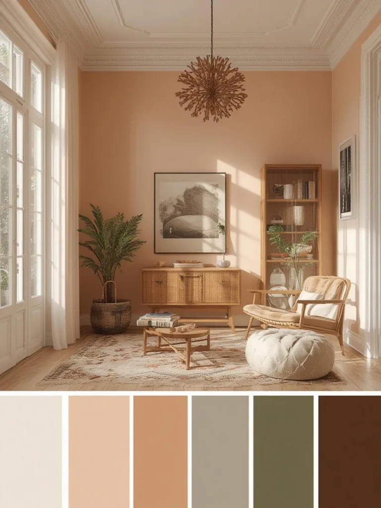
– Select a cohesive palette of 3-5 colors maximum to maintain visual flow
– Use lighter colors to make spaces feel larger
– Consider using the same color throughout with varying sheen levels for subtle dimension
– Implement color through accessories rather than multiple wall colors for rental properties
Season Considerations:
– Spring/Summer: Ideal for painting due to ventilation opportunities
– Fall: Good sales opportunities as painting season winds down
– Winter: Indoor humidity levels may affect drying time
Step-by-Step Guide
1. Assess Your Space
– Identify the room’s natural light exposure (north, south, east, or west)
– Note existing elements that must coordinate (flooring, countertops, furniture)
– Determine the room’s function and desired mood
2. Select Your benjamin moore paint color palette
– Start with the Benjamin Moore Color Collections for inspiration
– Choose a central color that speaks to you
– Select 2-3 complementary colors using their benjamin moore color coordination tools
– Include a neutral for balance
3. Test Your Colors
– Purchase sample pots of your selections
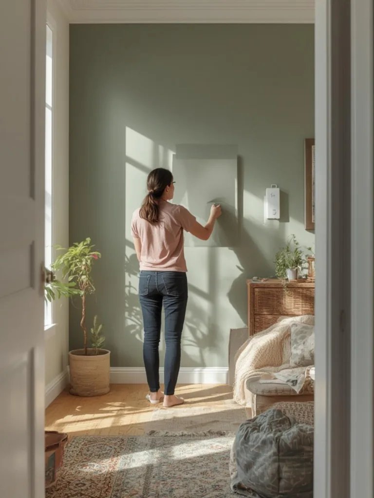
– Paint 2’x2′ swatches on white poster board
– Place samples on different walls and observe at various times of day
– Live with samples for at least 48 hours before deciding
4. Create Your Color Map
– Sketch a floor plan noting which color goes where
– Plan transitions between rooms for a cohesive flow
– Document your final selections (including exact names and numbers) for future touch-ups
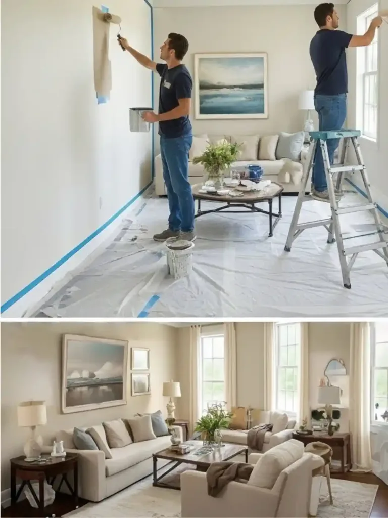
5. Prepare Your Space
– Clean walls thoroughly
– Repair any damage and sand smooth
– Apply primer if needed (especially when making dramatic color changes)
– Properly tape trim, outlets, and edges
6. Apply Paint Methodically
– Begin with ceilings, then walls, and finally trim
– Use the appropriate tools for each surface (rollers for large areas, brushes for edges)
– Apply thin, even coats rather than one thick coat
– Allow proper drying time between coats (follow manufacturer recommendations)
7. Evaluate and Adjust
– Assess color under different lighting conditions
– Make touch-ups as needed
– Consider adding accent colors through accessories if the wall color needs balancing
Benefits & Functional Advantages
A well-executed Benjamin Moore color scheme offers numerous benefits beyond pure aesthetics:
Psychological Impact:
– Properly coordinated colors can reduce stress and promote wellbeing
– Room-appropriate colors enhance functionality (calming in bedrooms, energizing in work areas)
– Cohesive color flow creates a sense of expansiveness and harmony
Property Value:
– Professional-looking paint jobs with premium brands like Benjamin Moore can increase home value
– Neutral Benjamin Moore palettes often appeal to broader segments of potential buyers
– Well-maintained paint in current colors signals a well-cared-for property
Environmental Benefits:
– Benjamin Moore’s Gennex® Color Technology delivers more durable finishes
– Longer-lasting paint means less frequent repainting and less waste
– Many Benjamin Moore lines offer low-VOC or zero-VOC formulations
Practical Advantages:
– Higher-quality pigments maintain true color longer without fading
– Premium formulations typically require fewer coats, saving time and material
– Better washability and stain resistance in high-traffic areas
Alternative Styles & Customization Ideas
Benjamin Moore’s versatility allows for numerous stylistic adaptations:
For Minimalist Spaces:
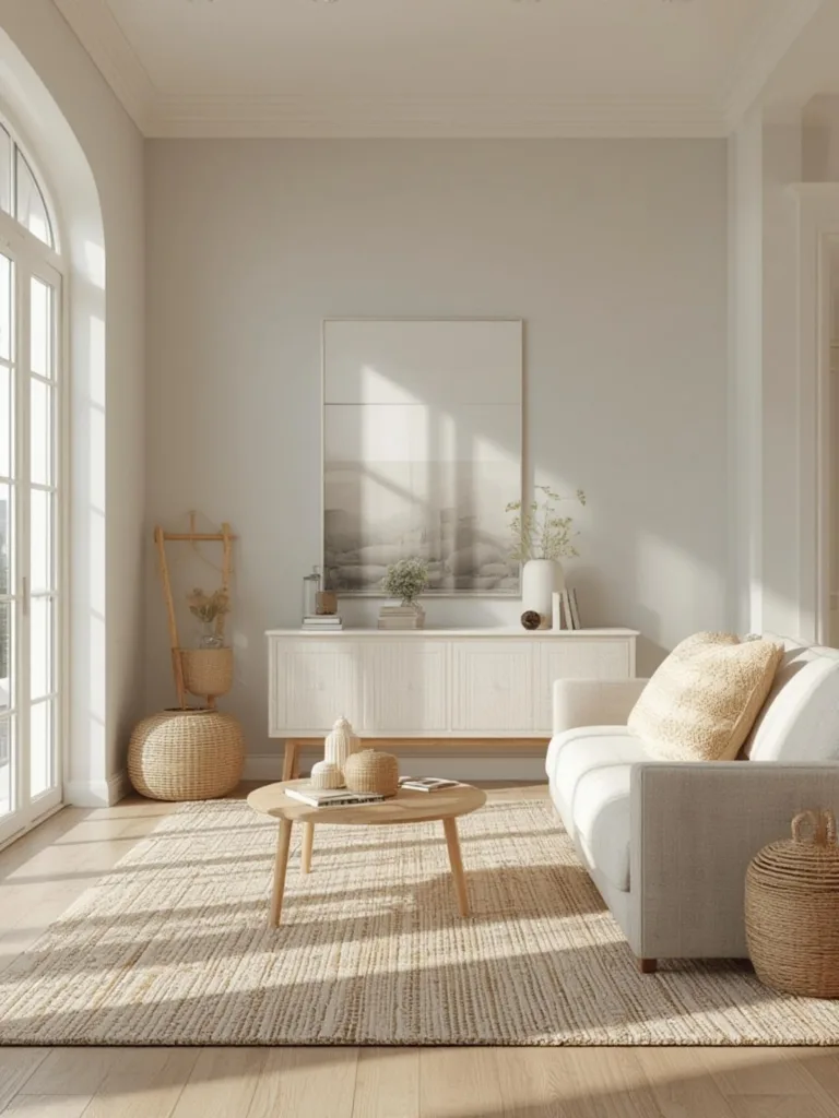
– Consider Benjamin Moore’s Off-White Collection for subtle variations
– Use monochromatic schemes with textural interest rather than color contrast
– Implement the “60-30-10 rule” with a restrained palette of three coordinating neutrals
For Maximalist Enthusiasts:
– Explore Benjamin Moore’s Historical Collection for rich, saturated hues
– Create dramatic moments with deep accent walls using colors like Hale Navy or Salamander
– Layer multiple coordinating colors within a single space
For Rentals and Temporary Spaces:
– Focus on removable color elements like peel-and-stick wallpaper in Benjamin Moore colors
– Use painted furniture in your desired palette rather than changing walls
– Incorporate color through textiles and art that reference your ideal palette
Regional Adaptations:
– Coastal homes: Benjamin Moore’s beach-inspired palettes (Ocean Air, Sea Salt)
– Desert dwellings: Warm neutrals with terra cotta accents (Decatur Buff, Tuscany)
– Northern exposures: Warming colors to counter cool light (Golden Retriever, Alexandria Beige)
Common Mistakes to Avoid
Color Selection Errors:
– Mistake: Choosing colors from tiny paint chips
Solution: Use larger samples or painted boards to evaluate colors accurately
– Mistake: Failing to consider existing fixed elements
Solution: Bring home samples of flooring, countertops, or fabric swatches to ensure coordination
– Mistake: Selecting colors in store lighting
Solution: Evaluate colors in the actual room under various lighting conditions
Application Mistakes:
– Mistake: Skipping proper wall preparation
Solution: Invest time in cleaning, patching, and priming for professional results
– Mistake: Using incorrect painting tools
Solution: Invest in quality brushes and rollers appropriate for your paint type
– Mistake: Applying inconsistent pressure when rolling
Solution: Maintain even pressure and overlap each pass by 50% for uniform coverage
Coordination Errors:
– Mistake: Choosing colors in isolation without considering flow between rooms
Solution: Create a whole-house color plan, even if painting one room at a time
– Mistake: Overwhelming a space with too many colors
Solution: Limit primary palette to 3-5 colors throughout the home
– Mistake: Matching colors exactly across elements
Solution: Aim for coordination rather than matching; slight variations add depth
Maintenance & Longevity Tips
To maximize your investment in Benjamin Moore paints:
Cleaning & Maintenance:
– Wait at least two weeks after painting before washing walls
– Use mild soap and water with a soft cloth for routine cleaning
– Avoid abrasive cleaners that can damage paint finish
– Keep touch-up paint properly sealed and labeled for future needs
Longevity Strategies:
– Choose higher-sheen finishes (eggshell, satin) for high-traffic areas
– Apply paint in optimal conditions (65-85°F, moderate humidity)
– Use proper primers for problematic surfaces
– Keep painted surfaces free from dust accumulation with regular dusting
Seasonal Refreshes:
– Clean walls thoroughly in spring to remove winter accumulation
– Check for moisture issues that might affect paint adhesion
– Touch up high-traffic areas annually
– Document your color selections for future reference
When to Repaint:
– Living and dining rooms: Every 5-7 years
– Bedrooms: Every 5-8 years
– Kitchens and bathrooms: Every 3-4 years
– Hallways and children’s rooms: Every 2-4 years
Conclusion
Creating a beautiful home environment starts with thoughtful color selection, and few brands offer the depth and quality of a benjamin moore paint color palette. By understanding the principles of benjamin moore color coordination and following our step-by-step approach, you can achieve a designer-worthy look that elevates your everyday living experience.
Remember that color is personal while trends come and go, the best palette is one that makes you feel at home. Take your time with the selection process, test thoroughly, and trust your instincts. Your perfect color story awaits, ready to transform your house into a harmonious, welcoming home that reflects your unique personality and lifestyle.
FAQs
What’s the best Benjamin Moore white for trim and ceilings?
White Dove (OC-17) and Simply White (OC-117) are perennial favorites for trim and ceilings due to their versatility. White Dove offers a softer, warmer white with subtle undertones that complement most wall colors, while Simply White provides a cleaner, crisper look without appearing stark. For modern spaces, try Chantilly Lace (OC-65) for its pure white quality without obvious undertones.
How do I coordinate paint colors between open-concept rooms?
For open-concept spaces, choose a cohesive color palette of 3-5 colors that work together. Use the same color for main walls throughout the open area, then incorporate coordinating colors for accent walls or adjacent spaces. Alternatively, select colors from the same color strip (different shades of the same hue) to create subtle transitions while maintaining flow.
Is it worth paying more for Benjamin Moore’s premium paint lines?
For high-traffic areas, kitchens, bathrooms, and main living spaces, Benjamin Moore’s premium lines (like Aura or Regal Select) offer superior coverage, durability, and washability that justify their higher cost. For less-used spaces like guest rooms or storage areas, their more economical ben® line provides good quality at a lower price point. The long-term performance benefits often outweigh the initial cost difference.
How can I test colors accurately without painting directly on my walls?
Paint large swatches (at least 2’x2′) on white poster board and tape them to different walls in your room. Move these samples around at various times of day to observe how lighting affects the color. This method allows you to evaluate colors without committing to wall application and provides a more accurate representation than small paint chips or digital renderings.

